Once you get a good rendering done, there are many ways to edit and manipulate in the post processing stage. Here are a few tips I use enhance and/ or manipulate my renderings.
First, create a high quality rendering with good lighting- the less post processing you have to do the better. For this purpose I rendered this image in 1920 x 1080 - 1080p. Make sure your Outline Overlay is selected as ON before you render. You can turn it off if you don’t like it, but it’s nice to have that option available.
A couple other settings I use before I render (the pre-rendering setting on the left side of advanced photo lab):
Natural Light
Render Quality set to 80. (80-85 is good- anything close to 100 will take a really, really, really long time. Like, go make dinner and come back long time.
Denoising: On
Light Setting: Depends on your application, but for this example, my sunlight was set to 21. (The sun gets brighter the higher the number.) Total light was 45 and camera was 8. Check the “preview shadows” button to get an idea of how bright the sun and shadows might be.
After I create a photo realistic rendering, I go ahead and save the JPEG. The I play with settings and save the JPEG again once I find setting I like. I sometimes do this a few times so that I can compare all the JPEG images at the end.
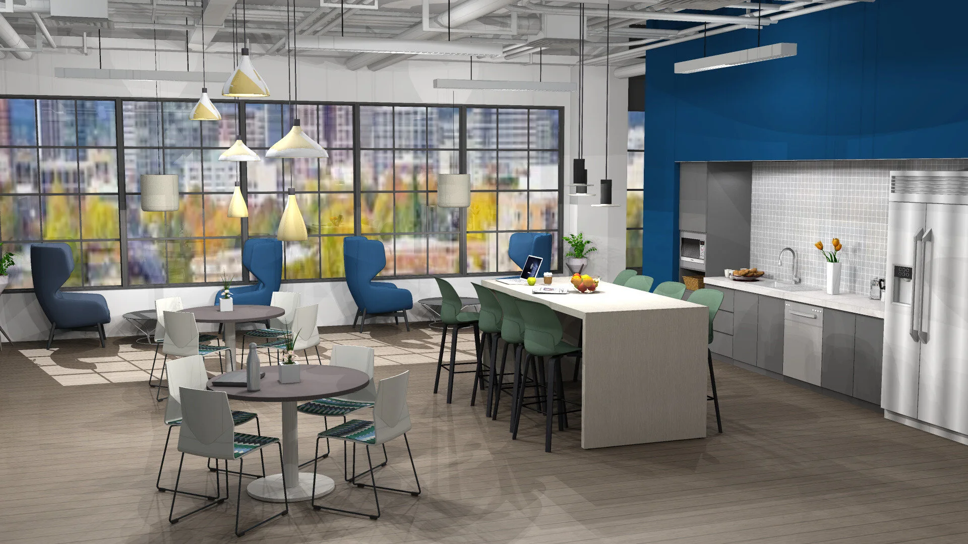
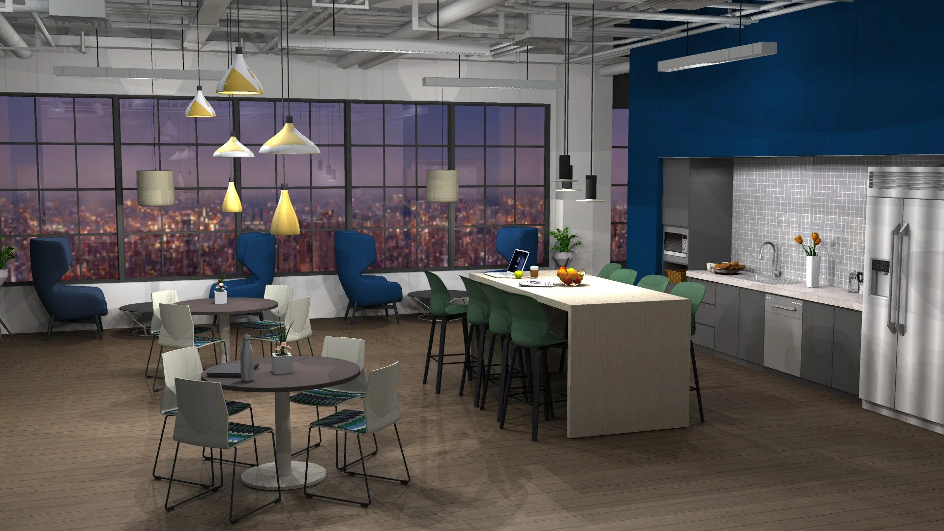
Here is an example rendering of a coffee/ break area to show how some of the settings can change your final rendering. I am showing the options with post processing on the top and with none below it. There are no right or wrong ways to do this, just play around until you get the image the way you want it to look. This rendering did not require a lot of post processing. However, I have lots of renderings that require way more work to brighten them up. Getting the lighting right can be really difficult sometimes.
WITH SOME POST PROCESSING
NO POST PROCESSING
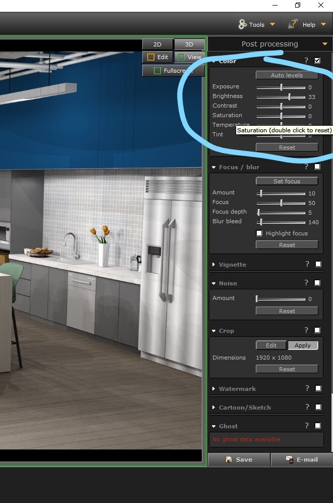
setting for photo realistic
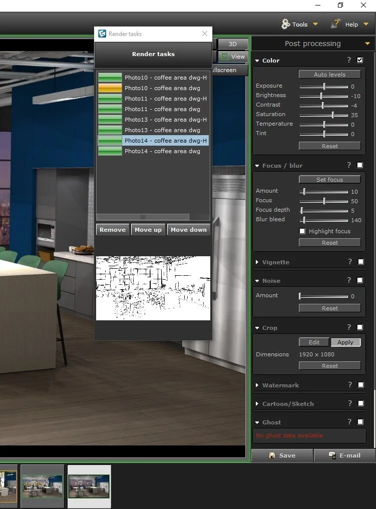
These are the setting used above. As you can see, I did not do much, just made the rendering a little brighter. The outline overlay was set to 11 for both line thickness and overlay (not shown).
I almost never use the Focus/ Blur, Vignette or Noise settings. I have never had a drawing benefit from changing those items.
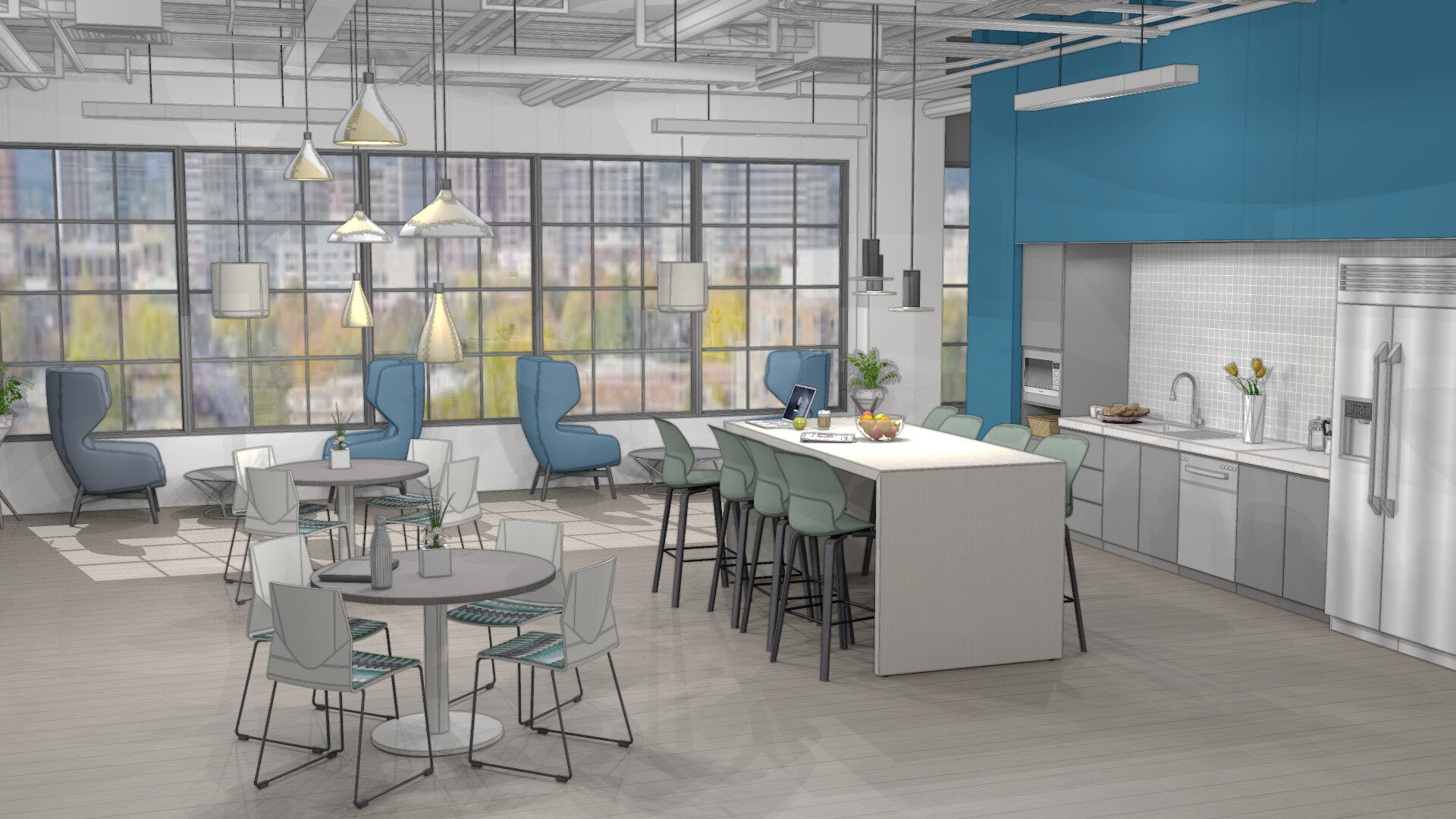
Here is another option: a rendering with a more washed out/ sketch up like look. This rendering style can be useful for the design development phase, especially if a client is unsure about finishes and may get hung up on specific fabrics or colors. Some end users respond to this style because it does not feel “final” and they feel open to making changes and suggestions.
As you can see above, the rendering has a more washed out almost watercolor look with a heavier outline. The key is to lower the color saturation and contrast down quite a bit.
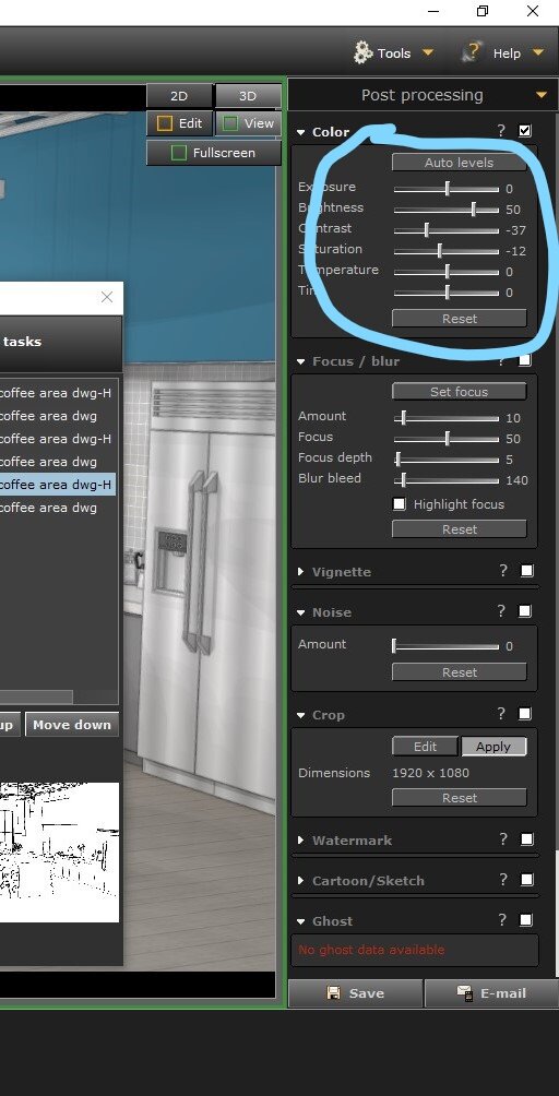
SETTINGS FOR THE “SKETCH UP” LOOKING RENDERING
Here- I really upped the Brightness to 50, then turned the Contrast and Saturation way down.
Not shown is the outline overlay- it is set to 48 for both line thickness and opacity.
PS- Did you know if you turn your saturation down to -100, you will have a grey scale rendering?
Last but not least- here is an option showing the same rendering at night (different city scape panorama in the background- but you get the idea!)
At Night
NIGHT TIME RENDERING
First, before you render, make sure your sunlight is set to 0. You should not have sun at night. :)
As you can to the right, I turned the brightness and contract down and the saturation up. The goal is to give the feeling of being indoors at night and noticing the brightness of the lighting fixtures more.
The temperature and tint settings are left at 0, because I can never make those setting look right.
Hope you find some of these tips and images helpful! Sometimes it can be hard to find the time to play with drawings, but playing around is really the best way to learn.
PS- Feel free to follow me over on Instagram As I add content to this blog I will post about it over there!.


